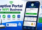


How to Design a Captive Portal That Converts WiFi Users Into Paying Customers
Learn how to design a captive portal that attracts users, builds trust, and converts WiFi visitors into paying customers through better layout, packages, and clear calls to action.

How to Design a Captive Portal That Converts WiFi Users Into Paying Customers
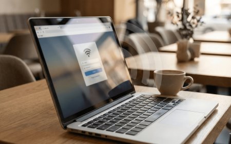
A captive portal is more than a login page. It is one of the most powerful sales tools in a WiFi hotspot business. Every customer who connects to your WiFi sees this page before they can access the internet. That means your captive portal has a big chance to convince users to buy a voucher.
If your captive portal is confusing, slow, or unattractive, customers may leave without buying. But if it is clear, professional, and easy to use, it can help you increase voucher sales and build trust.
In this guide, we shall explain how to design a captive portal that converts WiFi users into paying customers.
1. Start With a Clear Goal
Before designing your captive portal, you must understand its main goal. The main goal is not only to show a login box. The main goal is to help customers buy internet and connect easily.
Your captive portal should answer these questions quickly:
- What WiFi service is this?
- How much are the packages?
- How do I pay?
- Where do I enter the voucher code?
- Who do I contact for help?
If customers can answer these questions quickly, your portal is doing its job.
2. Use a Strong Headline
The headline is the first message customers see. It should welcome them and tell them what to do.
Examples of good headlines include:
- Welcome to WiFi YO
- Connect and Enjoy Fast Internet
- Buy a Voucher and Start Browsing
- Affordable WiFi Available Here
A strong headline helps customers understand the page immediately.
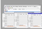
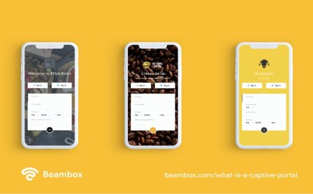
3. Make the Login Box Easy to Find
The login box should be visible without too much scrolling. If customers cannot find where to enter their voucher code, they may get frustrated.
Place the login box near the top or center of the page. Use a clear label such as:
Enter Voucher Code
The login button should also be clear and attractive. For example:
Login & Connect
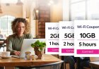
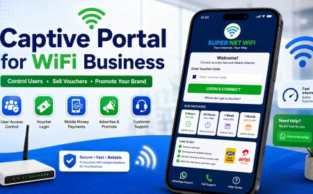
4. Show Packages Clearly
Customers should not have to ask you for prices. Your captive portal should show the packages clearly.
| Package | Price | Best For |
|---|---|---|
| 2 Hours | UGX 500 | Quick browsing |
| 24 Hours | UGX 1,000 | Daily use |
| 1 Week | UGX 6,000 | Best value |
| 1 Month | UGX 25,000 | Heavy users |
Use package cards if possible. Cards make the prices easier to read on phones.
5. Highlight the Best Package
Many customers need help choosing a package. You can guide them by highlighting the best value package.
For example, you can label the weekly package as:
Most Popular
Or:
Best Value: Save more with the weekly package.
This can encourage customers to buy bigger packages instead of always choosing the cheapest option.
6. Use Simple Payment Steps
A converting captive portal must make payment easy. Customers should understand the process without calling you.
How to Buy WiFi:
1. Choose your package.
2. Send payment to 07XXXXXXXX.
3. Use the Transaction ID as your voucher code.
4. Enter the code and click Login.
Keep the instructions short, direct, and close to the login form.
7. Add Trust Signals
Customers are more likely to buy when they trust your service. Add small trust signals to your captive portal.
Examples include:
- Fast and reliable internet
- Secure voucher login
- WhatsApp support available
- Trusted by local customers
- Affordable packages for everyone
These statements help customers feel safe paying for your service.
8. Use Brand Colors
Your captive portal should use your brand colors. This makes it look professional and consistent.
For example, if your brand uses blue and green, use those colors for headings, buttons, package cards, and icons.
Avoid using too many colors because the page can look confusing. Two or three main colors are enough.
9. Add Clear Call-to-Action Buttons
A call-to-action tells customers what to do next. Good buttons can improve conversions.
Examples:
- Buy Voucher Now
- Login & Connect
- Chat on WhatsApp
- View Packages
- Get Help
Make sure your buttons are large enough for phone users to tap easily.
10. Reduce Too Much Text
A captive portal should not look like a long document. Customers want to connect quickly.
Use short paragraphs, icons, cards, and bullet points. Long blocks of text can make customers ignore important instructions.
The goal is to guide the customer quickly from connection to payment to login.
11. Add Customer Support Options
Support options can save sales. Some customers may be ready to buy but get stuck during payment or login.
Add buttons like:
- WhatsApp Support
- Call Support
- How to Buy
- Forgot Voucher Code?
A customer who gets help quickly is more likely to buy again.
12. Make It Fast
A slow captive portal can reduce sales. If the page takes too long to open, customers may think your WiFi is slow.
To make the portal faster:
- Compress images
- Avoid too many videos
- Use lightweight icons
- Minimize unnecessary scripts
- Test loading speed on different phones
A fast page gives customers a better first impression.
13. Test on Different Phones
Your portal may look good on your computer but bad on a phone. Since most customers use phones, test it on different devices.
Test on:
- Android phones
- iPhones
- Small screen phones
- Large screen phones
- Tablets
Check if the login box, buttons, and packages display well.
14. Use Redirects Smartly
After login, you can redirect customers to a useful page. This can be a thank-you page, WhatsApp group, promotion page, or your website.
For example, after login, you can send users to:
- A page showing your latest offers
- A customer help page
- Your Finjora website
- A WhatsApp group join page
This helps you continue communicating with customers after they connect.
15. Conclusion
A captive portal that converts should be clear, fast, professional, and easy to use. It should show customers your packages, explain how to pay, provide support, and make login simple.
The best captive portal design is not the most complicated one. It is the one that helps customers buy and connect without confusion.
If you design your portal properly, it can become one of the best tools for increasing voucher sales in your WiFi hotspot business.
Want More Captive Portal Design Tips?
Visit Finjora.com for more WiFi business guides, hotspot login page ideas, MikroTik setup tutorials, and voucher sales strategies.
What's Your Reaction?
 Like
0
Like
0
 Dislike
0
Dislike
0
 Love
0
Love
0
 Funny
0
Funny
0
 Angry
0
Angry
0
 Sad
0
Sad
0
 Wow
0
Wow
0