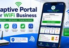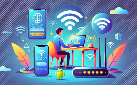


How to Add Payment Instructions on a Captive Portal the Right Way
Learn how to display payment instructions clearly on your WiFi captive portal so customers can pay easily using mobile money and login without confusion.
How to Add Payment Instructions on a Captive Portal the Right Way
Payment instructions are one of the most important parts of a WiFi captive portal. A customer may want to buy internet, but if they do not understand how to pay or where to enter the voucher code, they may leave without buying.
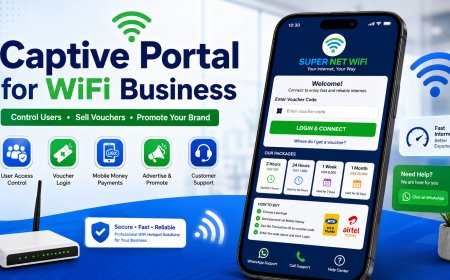
In a hotspot business, your captive portal should not only show the login form. It should clearly explain how customers can choose a package, make payment, receive or find their voucher code, and login successfully.
In this guide, we shall explain how to add payment instructions on a captive portal the right way so that customers can buy WiFi easily.
1. Why Payment Instructions Matter
Many customers are not technical. Some may be using your WiFi service for the first time. They may not know whether they should pay by cash, mobile money, WhatsApp, agent, or online payment.
If your instructions are not clear, customers may get confused and contact you again and again. Worse still, they may decide not to buy.
Clear payment instructions help you:
- Reduce customer confusion
- Increase voucher sales
- Reduce support calls
- Make your business look professional
- Help customers login faster
- Build trust in your service
2. Keep the Instructions Short and Simple
Your payment instructions should be easy to understand. Avoid using too many technical words.
A simple instruction format can be:
1. Choose your package.
2. Pay using mobile money.
3. Use the Transaction ID as your voucher code.
4. Enter the code and click Login.
This is better than writing a long paragraph that customers may not read.
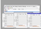
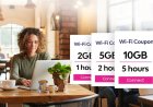
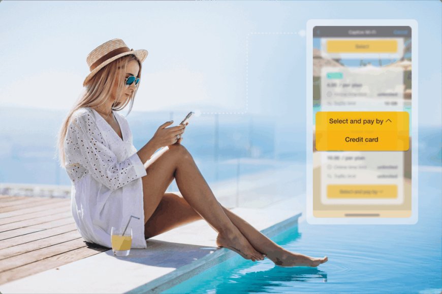
3. Show Package Prices Before Payment Instructions
Before telling customers how to pay, first show them what they can buy. Package prices should be clear and easy to compare.
| Package | Price | Validity |
|---|---|---|
| 2 Hours | UGX 500 | 2 Hours |
| 24 Hours | UGX 1,000 | 1 Day |
| 1 Week | UGX 6,000 | 7 Days |
| 1 Month | UGX 25,000 | 30 Days |
After seeing the package, the customer can easily decide how much to pay.
4. Tell Customers Exactly Where to Pay
Do not only say “send payment.” Show the exact payment number or payment method.
Example:
Send payment to:
Mobile Money Number: 07XXXXXXXX
Name: WiFi YO
This helps customers confirm they are paying the right number.
5. Explain the Transaction ID Clearly
If your system uses the transaction ID as the voucher code, explain it clearly. Many customers may not know what a transaction ID is.
You can write:
After payment, check the mobile money SMS message you receive. Your voucher code is the Transaction ID in that message.
You can also give an example:
Example Transaction ID: 146231579265
Enter this number as your voucher code.
This makes the process easier for first-time users.
6. Place Payment Instructions Near the Login Box
The payment instructions should be close to the voucher login box. If the instructions are far away, customers may not see them.
A good layout can be:
- Logo and welcome message
- Package prices
- Payment instructions
- Voucher code login box
- Support buttons
This layout guides the customer step by step.
7. Use Icons for Payment Methods
Icons make payment instructions easier to understand. You can use mobile money icons, phone icons, voucher icons, and WiFi icons.
For example, you can show:
- MTN Mobile Money
- Airtel Money
- M-Pesa
- Flutterwave
- Cash Agent
Visual payment icons help customers quickly recognize the payment options you accept.
8. Add a WhatsApp Button for Payment Help
Some customers may pay but fail to find their transaction ID. Others may send money to the wrong number or enter the code incorrectly.
A WhatsApp button helps them contact support quickly.
The button can say:
- Need Help?
- Chat on WhatsApp
- Payment Support
- Send Payment Screenshot
This improves customer support and reduces frustration.
9. Use a Strong Call-to-Action
A call-to-action tells the customer what to do next. Your captive portal should not leave customers guessing.
Examples of good call-to-action text include:
- Pay Now and Start Browsing
- Buy Voucher Now
- Enter Code and Connect
- Choose Package and Pay
- Login & Connect
A clear call-to-action can help increase sales.
10. Add Instructions for Agents
If you sell vouchers through agents, include agent information on the portal.
Example:
You can also buy vouchers from our nearby agents. Ask for WiFi YO voucher and enter the code here.
This is useful in communities where customers prefer buying from shops or local agents.
11. Show What to Do After Payment
Do not stop at payment. Tell the customer what to do after paying.
Example:
After payment, wait for the payment message. Copy the Transaction ID and enter it in the voucher box above. Then click Login.
This step is important because some customers may pay but not know how to continue.
12. Add a Warning About Wrong Payment
You can include a small warning to help customers avoid mistakes.
Please confirm the payment number before sending money. Payments sent to a wrong number may delay your access.
Keep the warning polite and simple.
13. Make Instructions Mobile-Friendly
Most customers will read your payment instructions on a phone. Make sure the text is readable.
Use short lines, enough spacing, large buttons, and clear colors. Avoid writing too much text in one block.
Mobile-friendly instructions make it easier for customers to pay quickly.
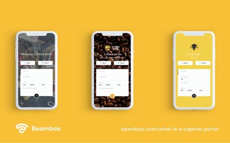
14. Example Payment Instruction Section
Here is an example you can use on your captive portal:
How to Buy WiFi
1. Choose your package from the list.
2. Send payment to 07XXXXXXXX.
3. Check your mobile money message.
4. Use the Transaction ID as your voucher code.
5. Enter the code and click Login.
This section is simple, direct, and easy to understand.
15. Conclusion
Payment instructions are very important on a WiFi captive portal. If customers understand how to pay and login, they are more likely to buy.
Keep your instructions simple, show package prices clearly, explain the transaction ID, place the instructions near the login box, and add support buttons for customers who need help.
A clear payment guide can reduce support calls, increase voucher sales, and make your WiFi hotspot business look more professional.
Need More Hotspot Payment Guides?
Visit Finjora.com for more guides about captive portals, MikroTik hotspot setup, mobile money payments, voucher systems, and WiFi business growth.
What's Your Reaction?
 Like
0
Like
0
 Dislike
0
Dislike
0
 Love
0
Love
0
 Funny
0
Funny
0
 Angry
0
Angry
0
 Sad
0
Sad
0
 Wow
0
Wow
0